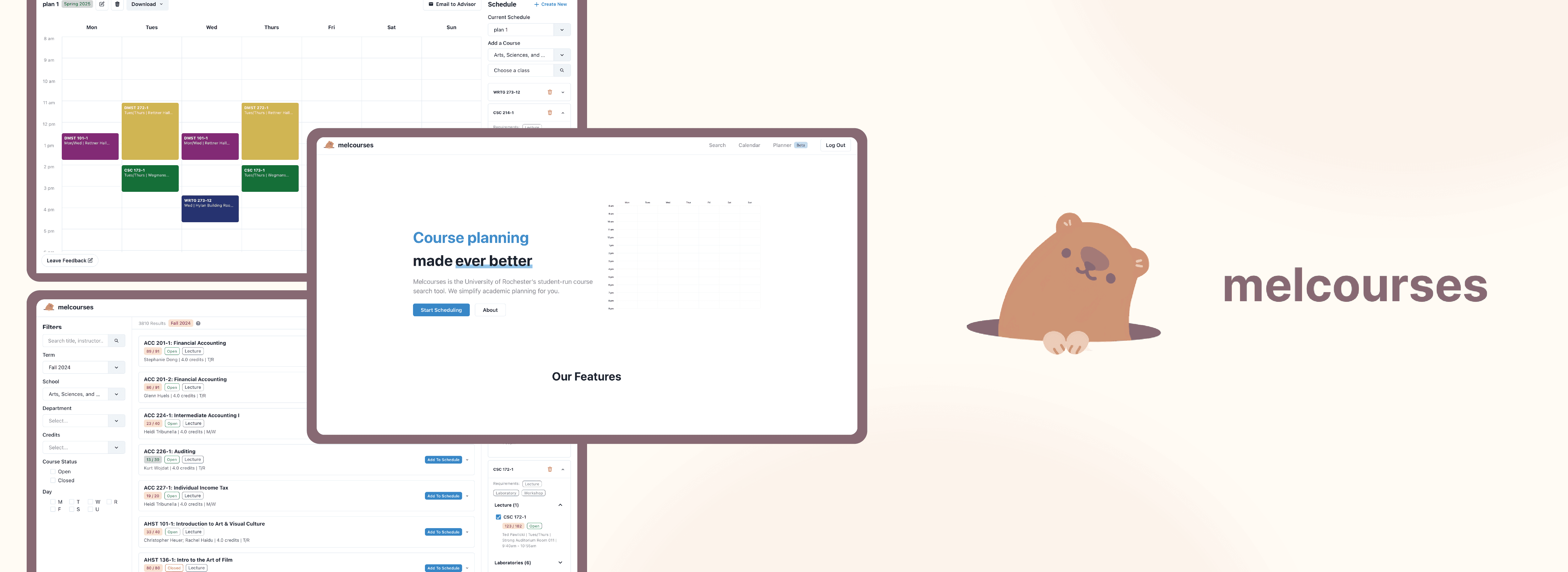
Melcourses
Date
Ongoing
Role
UI/UX Designer
Background
Melcourses is an unofficial course planning website to help University of Rochester students plan their upcoming semester schedules. The Melcourses UI/UX team is made of 4 designers and we work on maintaining the UI and implementing new features to our live website. To implement our designs, we work with a team of 6 developers.
Context
I joined this team after Melcourses had been established, so I was not involved in any of the original UI exploration or brand identity ideation. I was brought on to help develop new features and renovate the existing UI.
Overview
I worked on 3 features as part of Melcourses. You can view the process of each feature using the tabs below.
Cluster Search
Calendar Page
4-Year Planner
Cluster Search Engine
Context
The University of Rochester requires students to take courses in each academic division (natural sciences, social sciences, humanities) to graduate.
Clusters fall under one of the three academic divisions and consist of a few courses. Students can take clusters to fulfill academic divisions not covered by their major(s)/minor(s).
The Problem
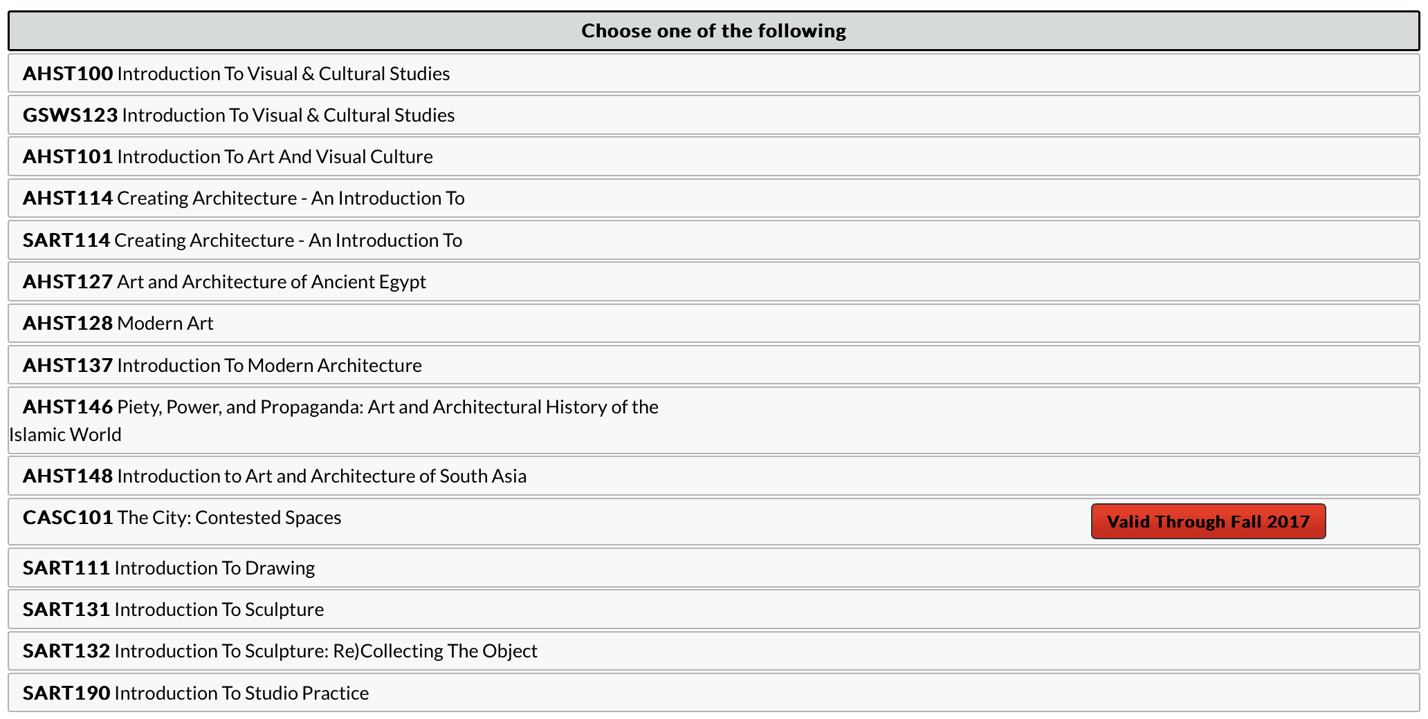
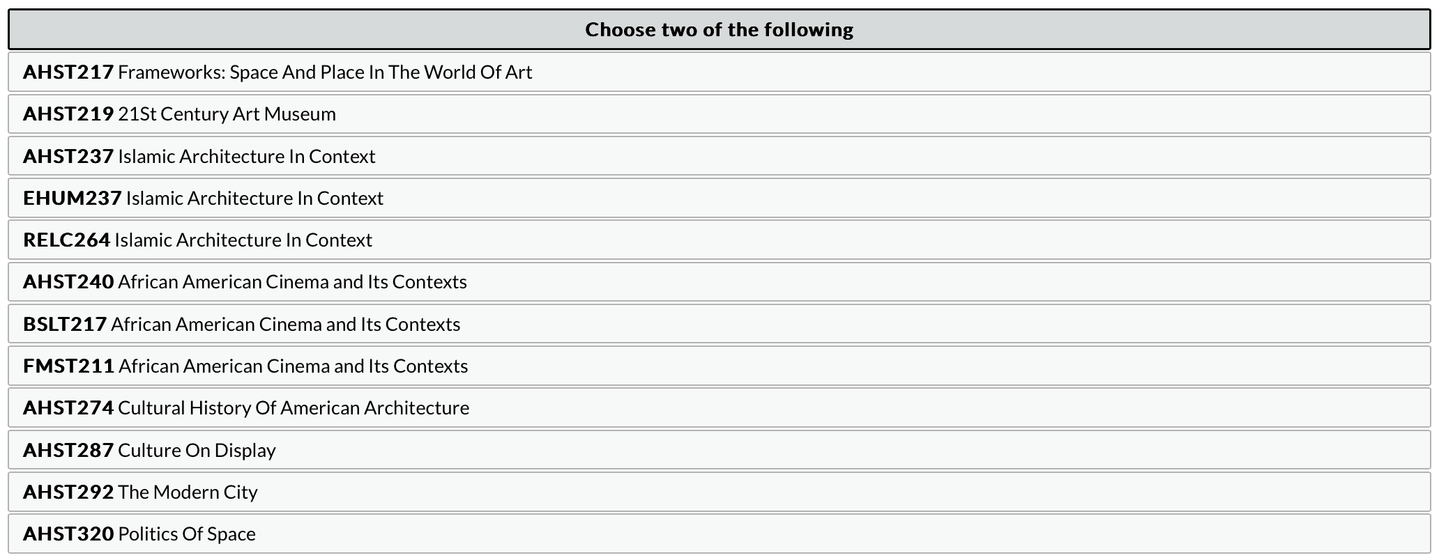
The official cluster search engine has a clunky and difficult to understand design.
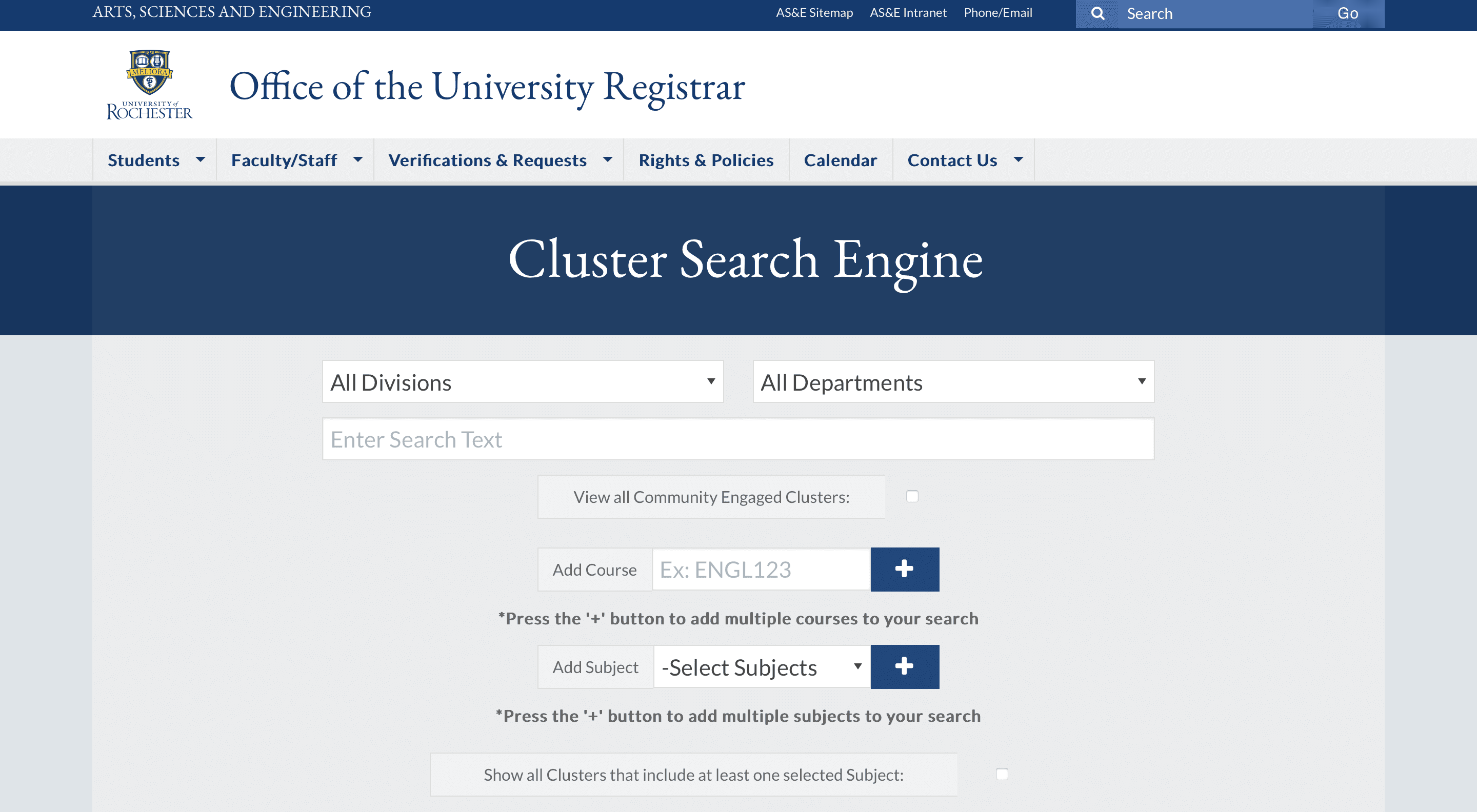

Here are the problems we found with this design:
Upon search, all results are fully displayed, leading to unnecessary scrolling.
The language is inconsistent. Ex. "Choose one of the following" and "You may also choose one of the following."
Courses are displayed that haven't been offered in over 5 years.
Goal
We wanted to make Melcourses' version of the cluster search engine less overwhelming while staying within the existing Melcourses brand identity.
Iteration
We started with a layout that looked like our existing course search page. We kept these things consistent:
Filters on the left
Search results in the center, with results taking up most of the page space
Editing on the right
Button shape and colors
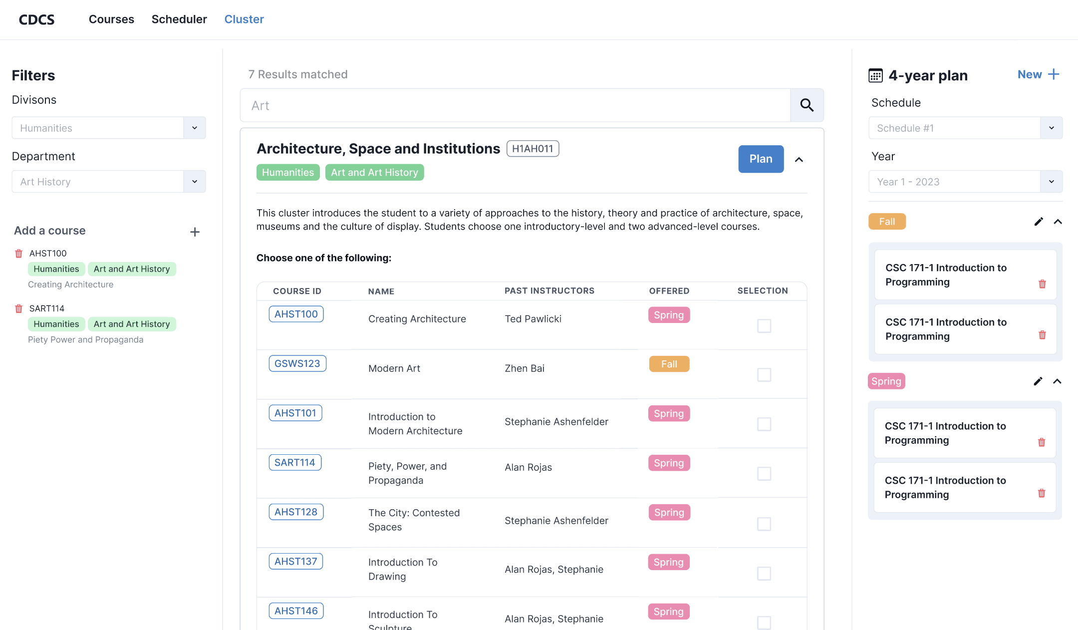
Users can see the IDs of the courses offered in the cluster, the past instructors of each course, what semesters courses are offered in, and the ability to select a course to take in a cluster.
In addition, we were also playing with the idea of having a modal for the process of selecting the courses to take in a cluster.
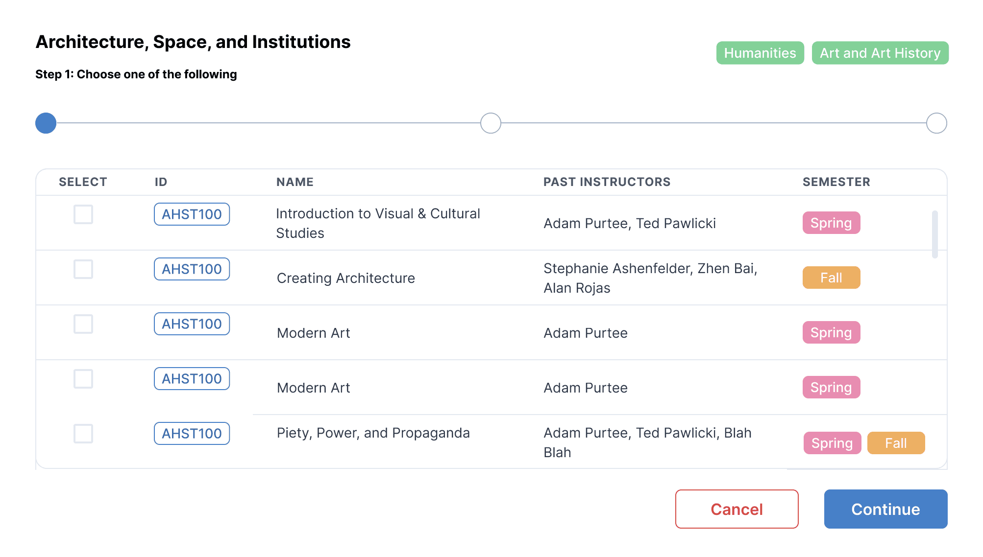
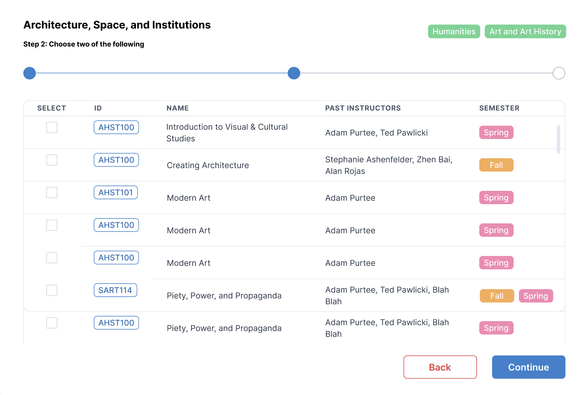
The steps of the modal mirror the steps of the official cluster search engine, where step 1 corresponds to the first set of choices displayed in a cluster, step 2 corresponds to the second set of choices displayed in a cluster, and so on.
For the next iteration, we made changes to all sections of the page.
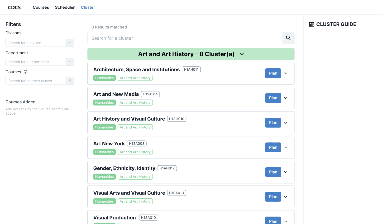
To summarize changes:
We gave users the ability to look up clusters that include specific courses and made it fit it with existing design principles
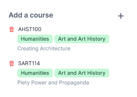
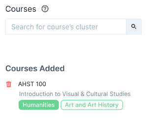
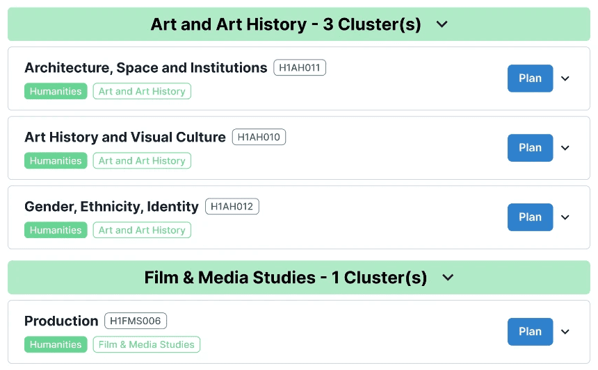
Introduced category headers for clusters, mirroring the official cluster search engine design
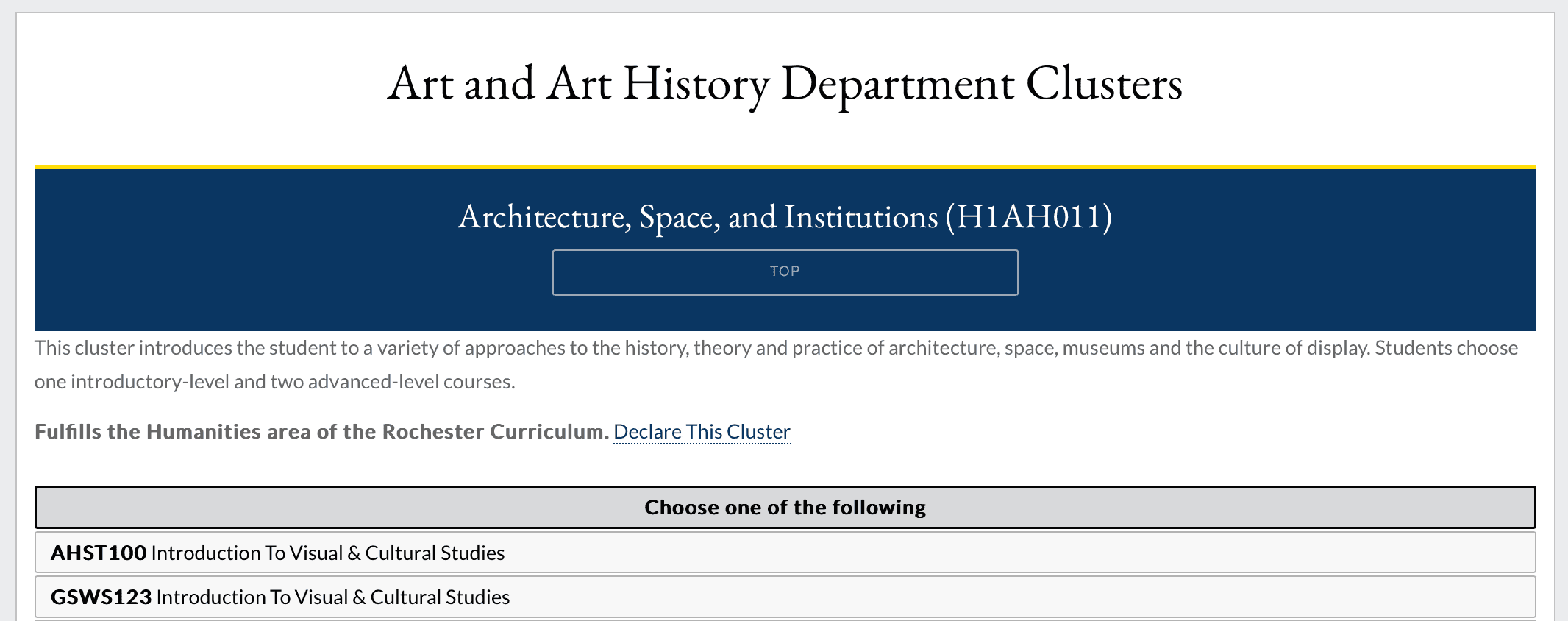
Replaced 4-year planner integration with a cluster guide
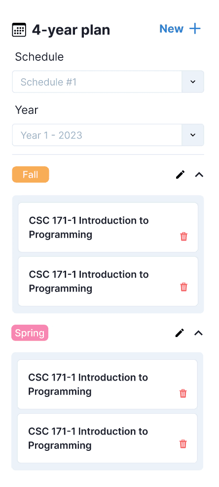
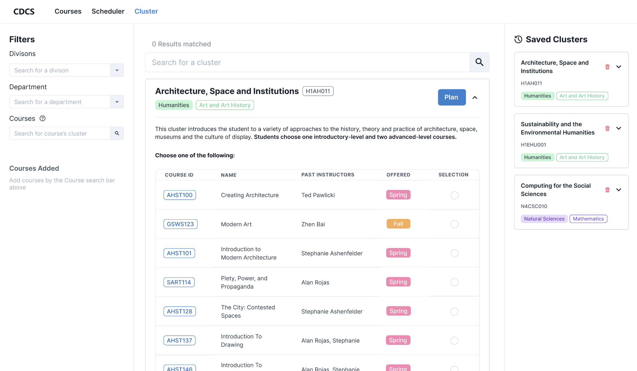
The next iteration, we scrapped the cluster guide section for a saved cluster feature. The cluster guide wasn't useful for the majority of users since the school makes it known that clusters are apart of a graduation requirement.
We replaced the righthand section with saved clusters, which allows users to save their cluster selections without adding them to a schedule or plan.
As for the saved cluster cards, we had two variations for the design. Users could either edit their saved clusters by section or edit the entire cluster at once.
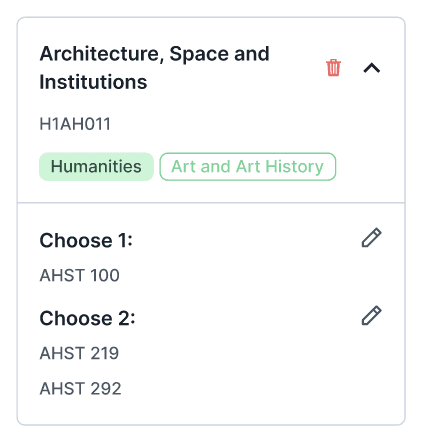
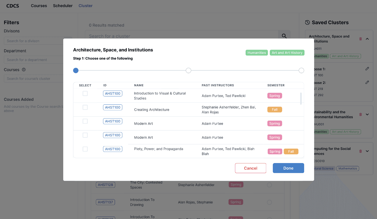
Each section can be edited, and clicking on an edit button will take the user to the appropriate step in the modal.
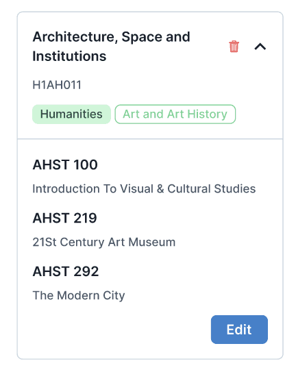
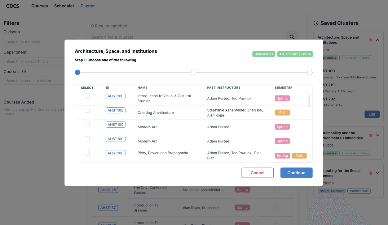
Only the whole cluster can be edited, which takes the user through each step of the selection process again. User course choices would be saved.
Our team voted to use the design of letting users edit a cluster by its section, which led to the iteration below. We made some visual changes to the saved cluster cards, like making the edit button blue to indicate it's selectable or adding in course names next to the course ID.
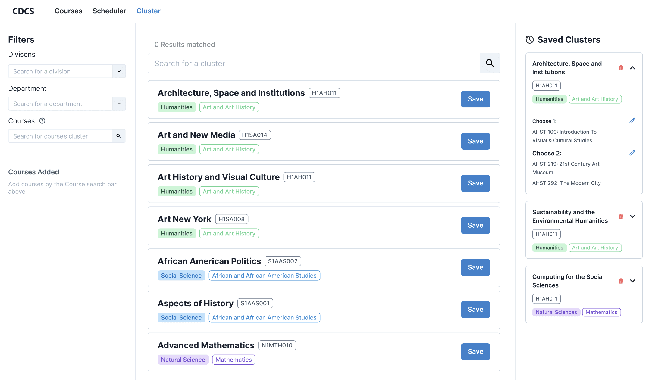
When users click the Save button, they're taken to a step-by-step modal selection screen. We removed the drop-down from the cluster card and put the information within the drop-down into the modal instead.
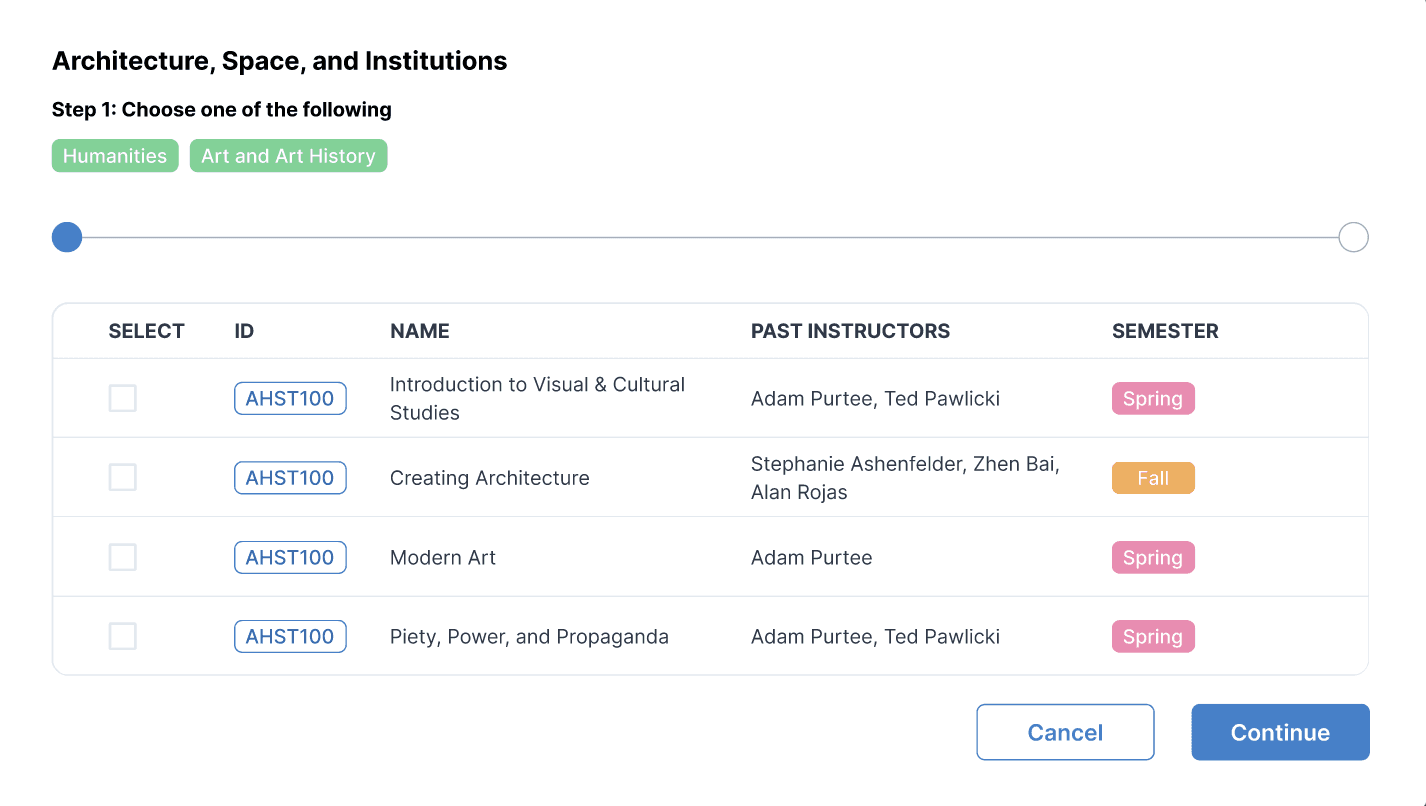
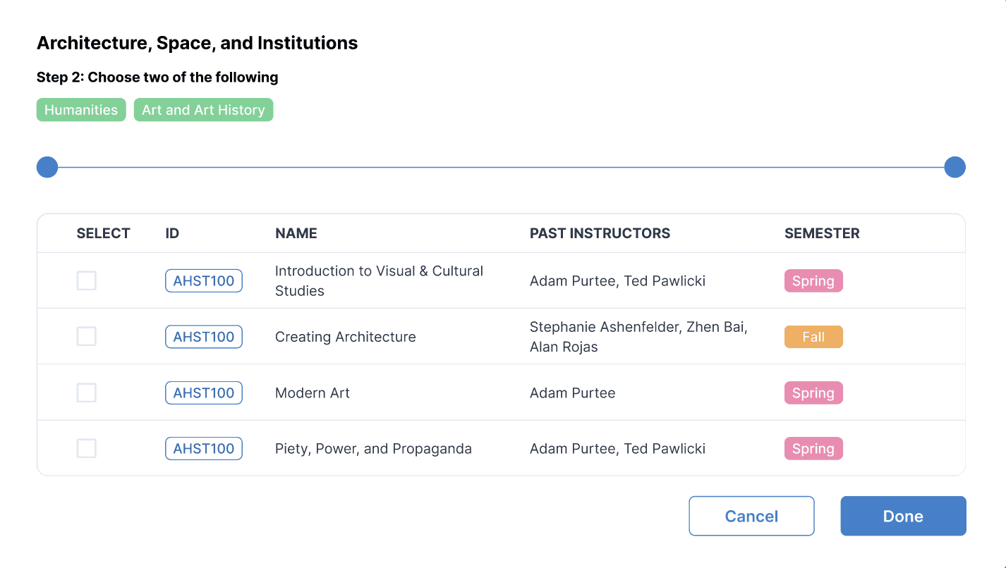
After receiving feedback, we returned the drop-down feature. Users would be able to look at cluster information via the drop-down, but not be able to select courses in the drop-down (unlike before). Cluster course selection would only be accessible by clicking the Plan button.
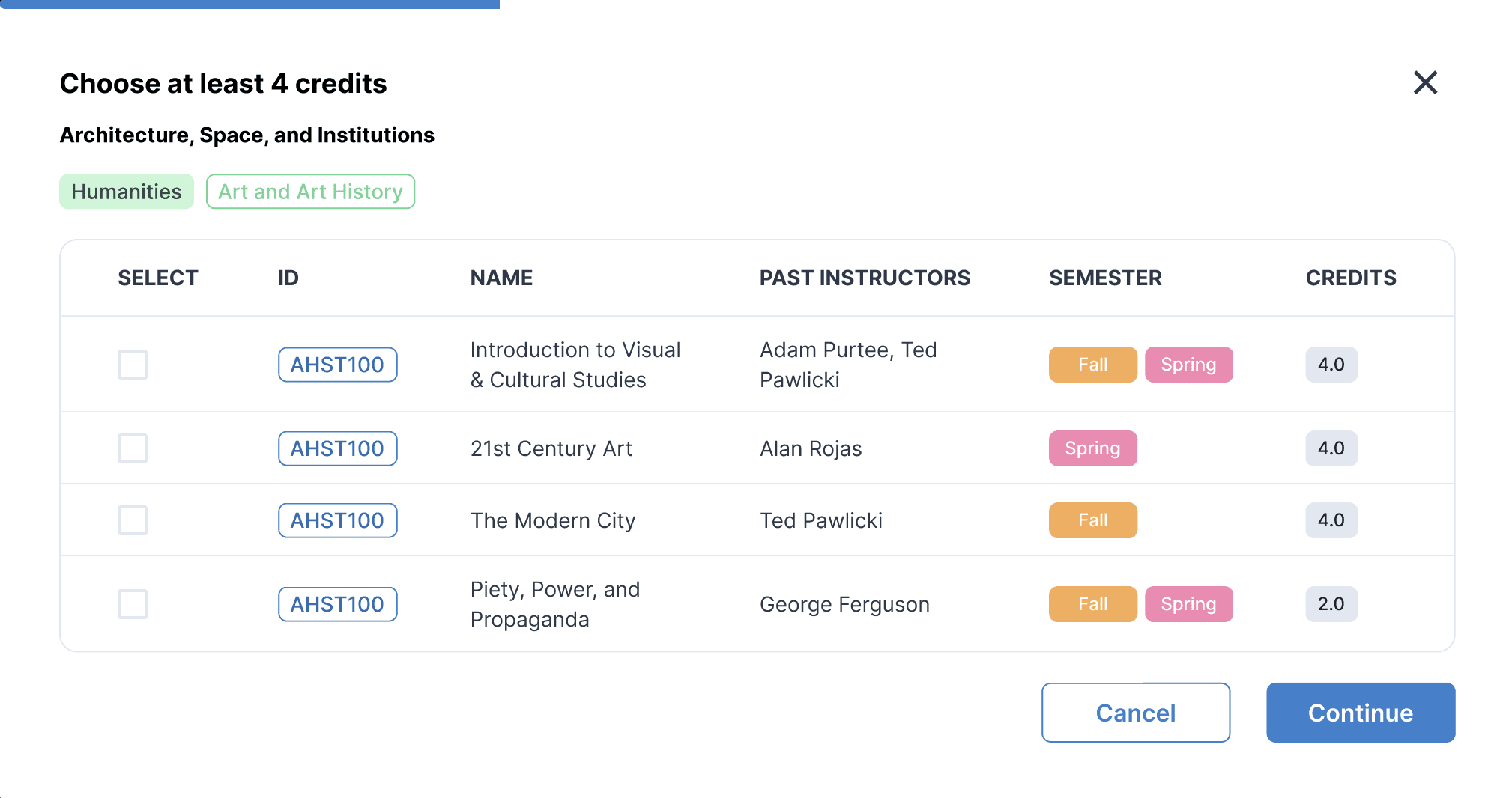
For modal changes, we wanted to implement a better way for users to visualize their selection progress. We took inspiration from LinkedIn's easy apply modal.
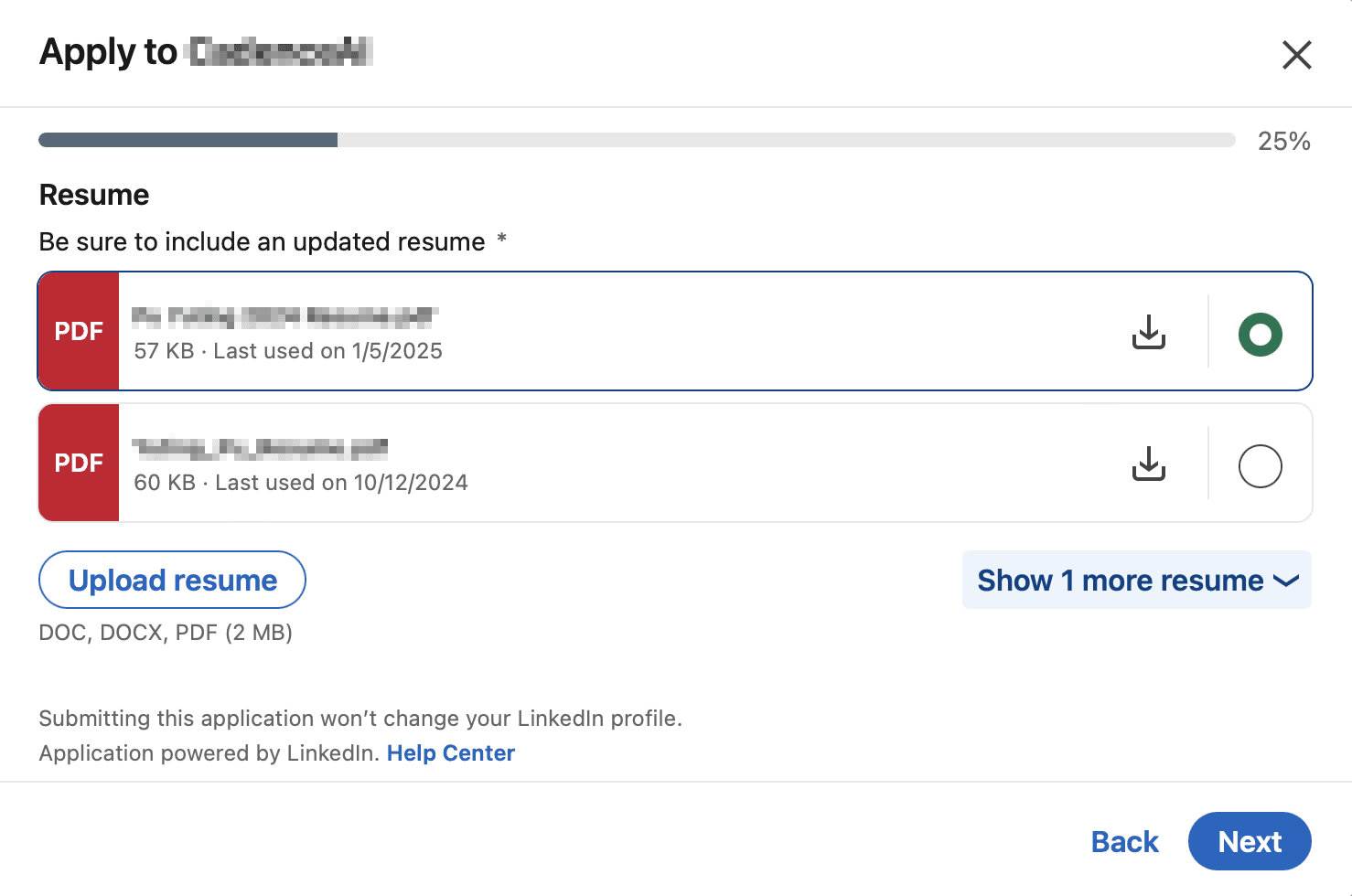
We mainly liked the progress bar they used, which we translated into the design below.
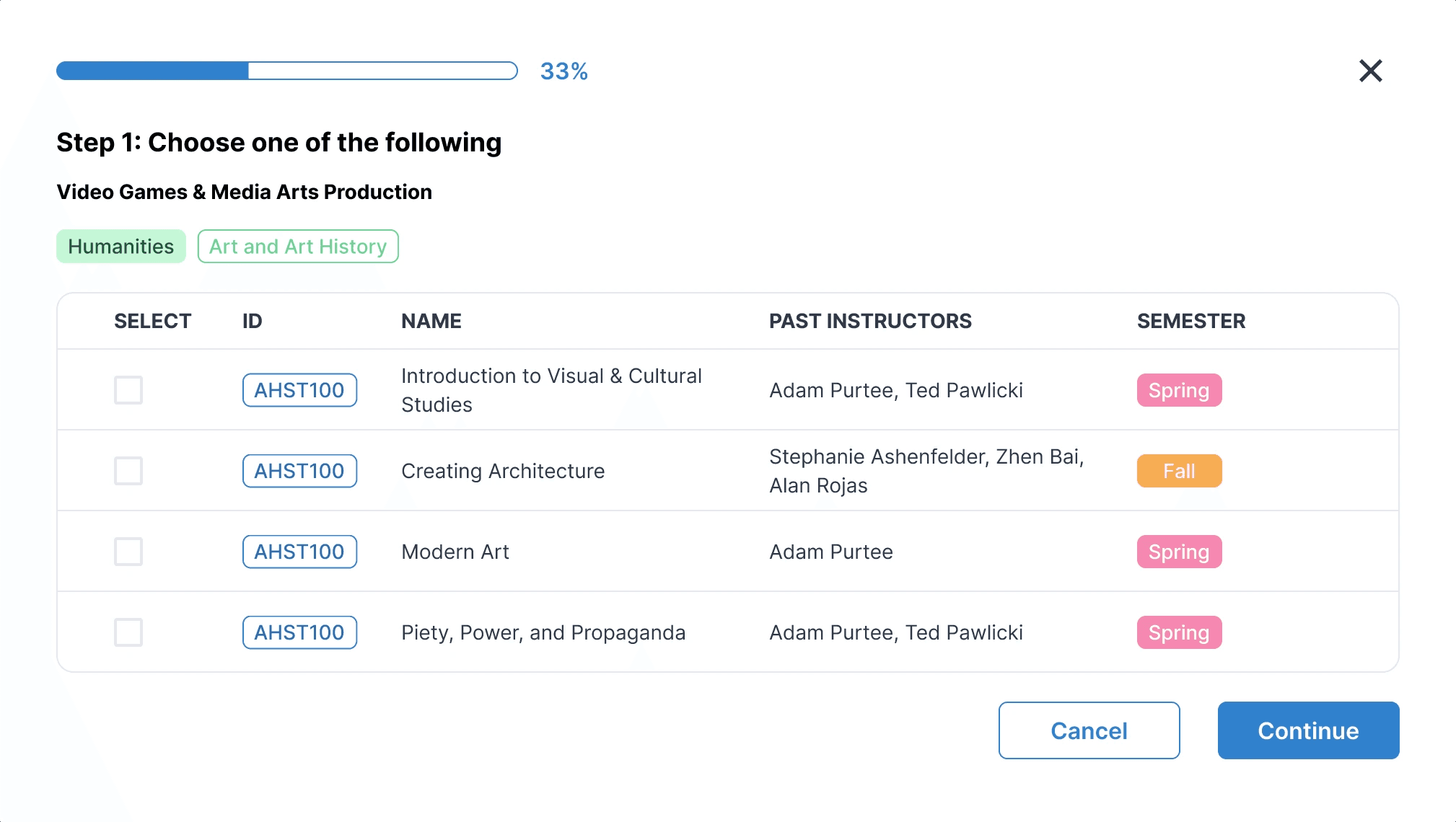
Upon the next iteration, we made these changes:
Put the progress bar at the top and removed the percentage, as that was already indicated by progress bar size
Added a "Credits" column
Removed "Step X" text, as that information was redundant due to the progress bar
Final Design
For the final design, we considered 4 different user journeys on the cluster search page.
Searching and Filtering Clusters
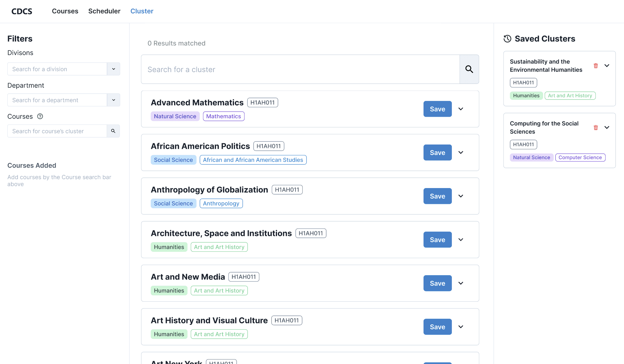
User starts on the cluster search page with no filters selected.
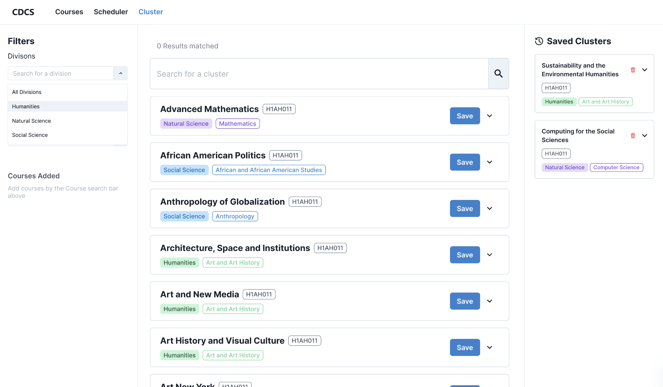
User clicks on the division filter and chooses between humanities, natural science, social science, or all divisions.
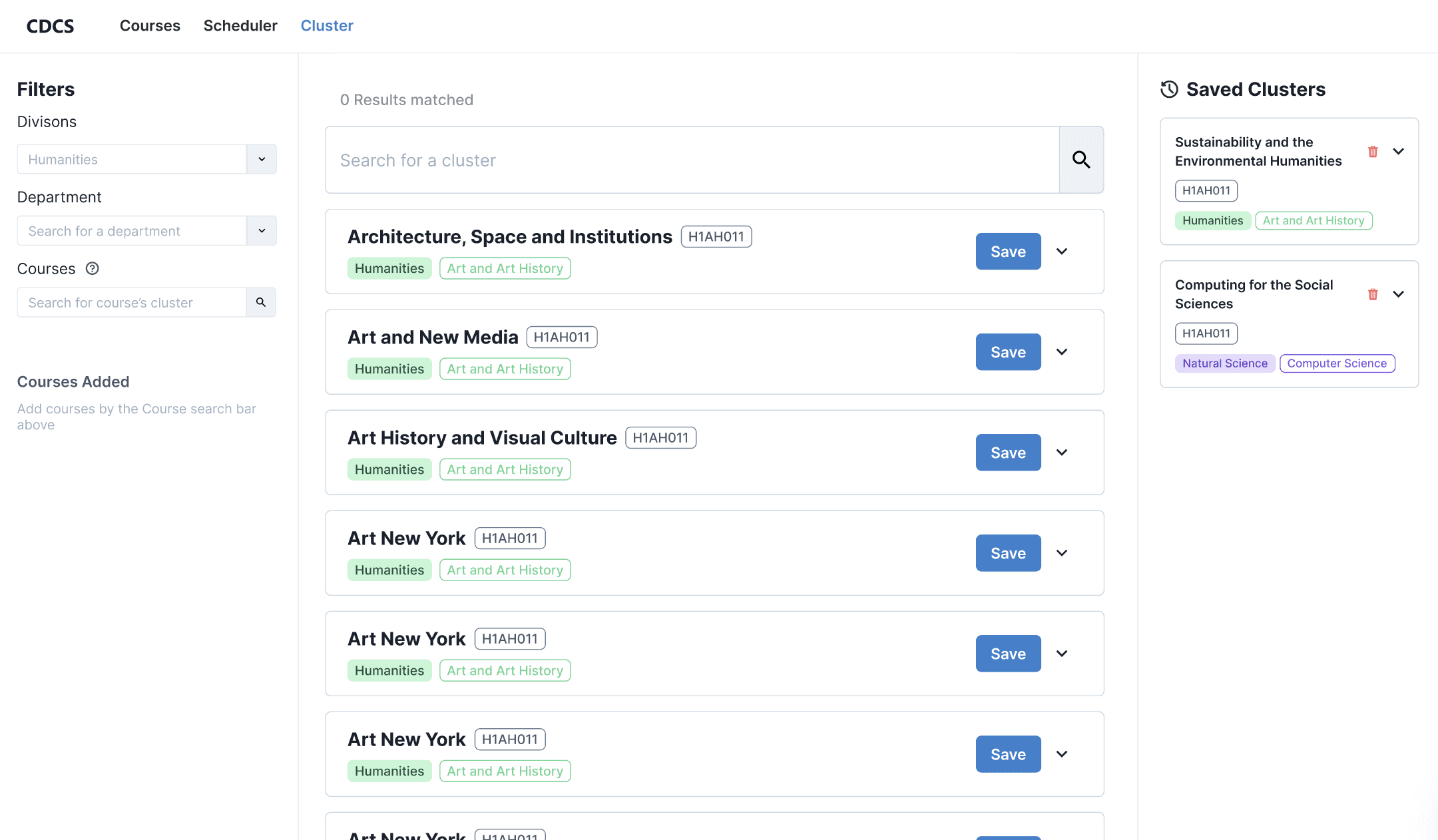
When sorted by humanities, for example, then clusters that belong to the humanities division are shown.
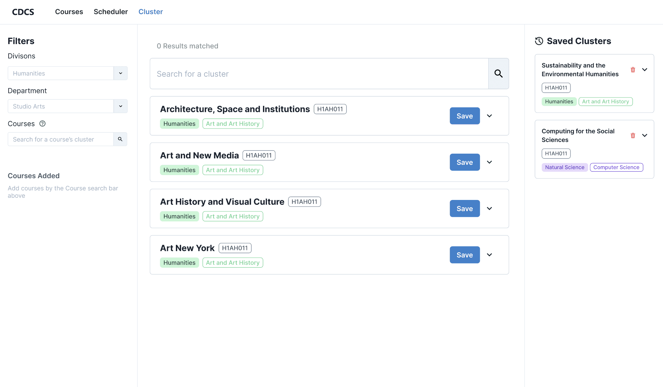
User filters by the studio art department and now clusters that are in the humanities division AND studio art department are shown.
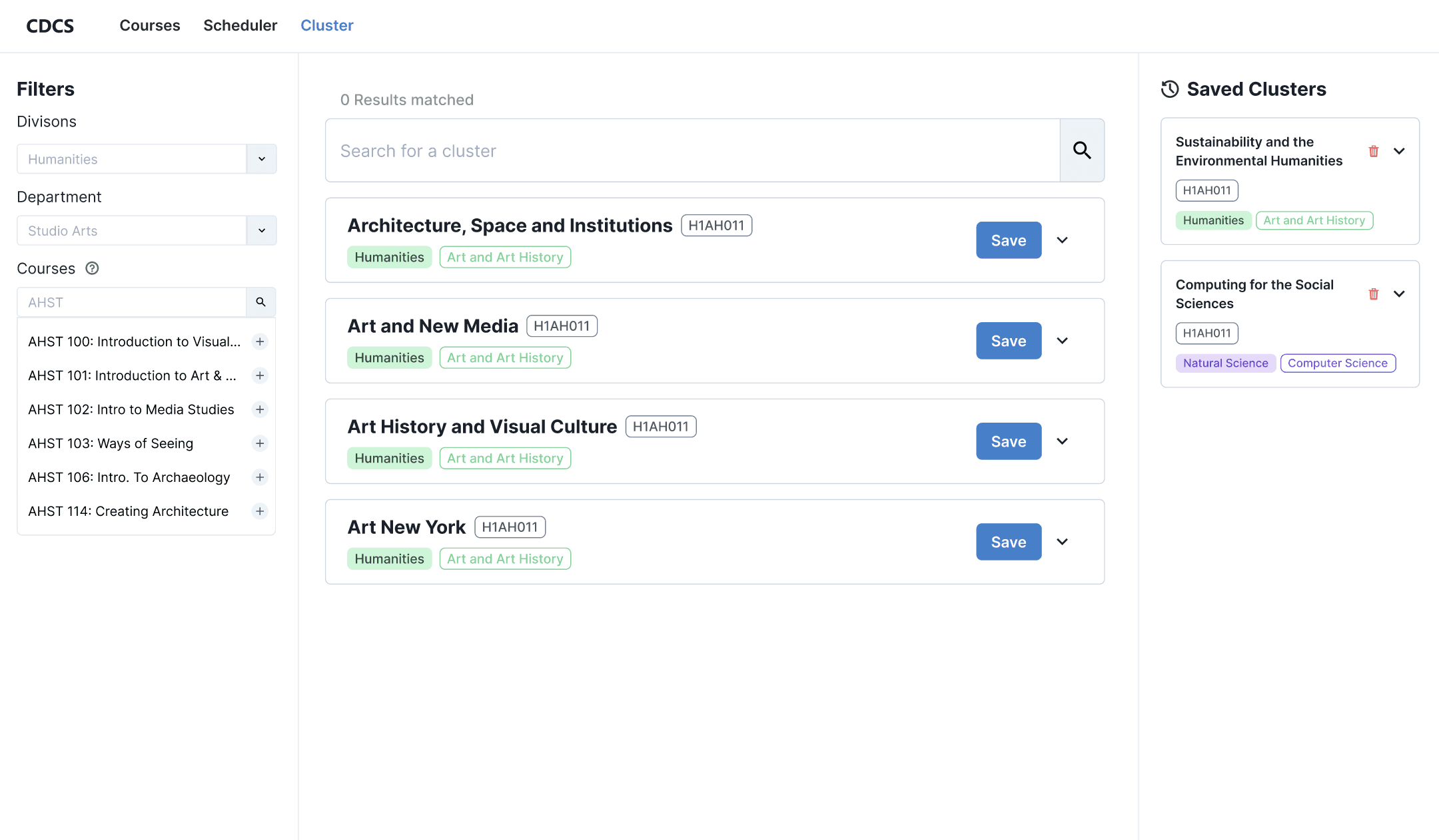
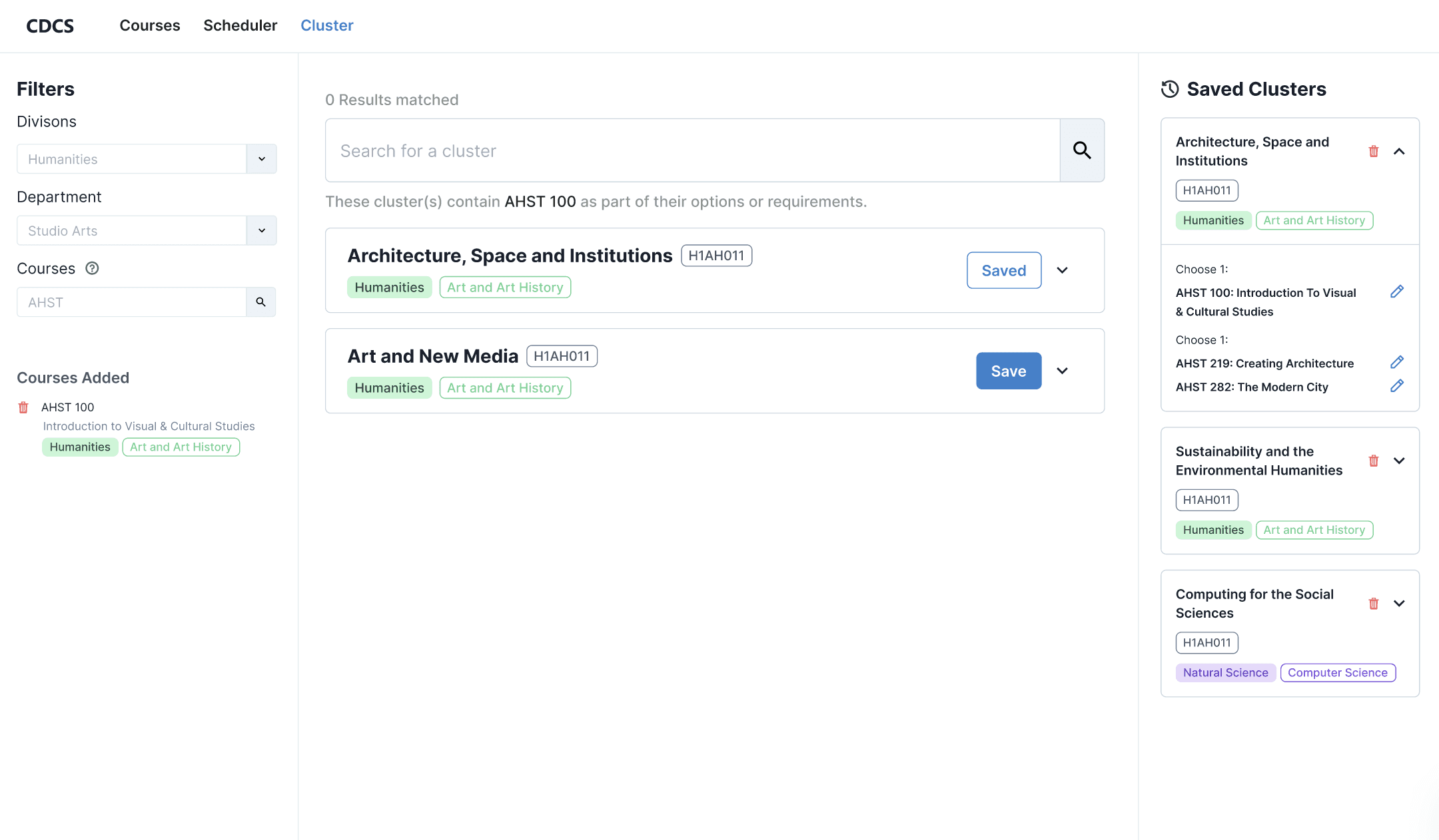
User searches for clusters that include a specific art history (AHST) course.
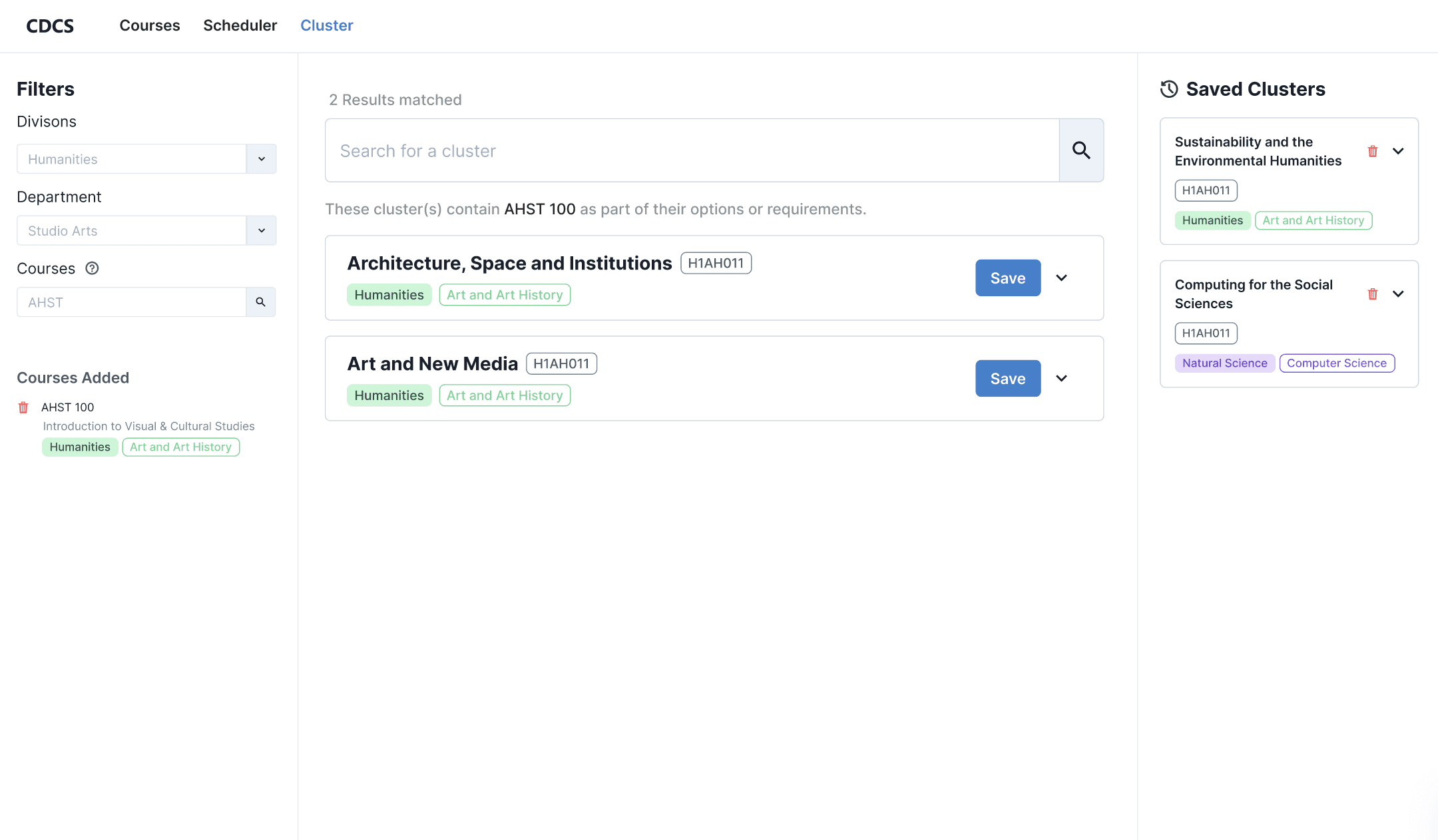
Only clusters in the humanities division, studio art department, AND include the AHST 100 course are shown.
User starts on the cluster search page with no filters selected.
User clicks on the division filter and chooses between humanities, natural science, social science, or all divisions.
When sorted by humanities, for example, then clusters that belong to the humanities division are shown.
User filters by the studio art department and now clusters that are in the humanities division AND studio art department are shown.
User searches for clusters that include a specific art history (AHST) course.
Only clusters in the humanities division, studio art department, AND include the AHST 100 course are shown.
User starts on the cluster search page with no filters selected.
User clicks on the division filter and chooses between humanities, natural science, social science, or all divisions.
When sorted by humanities, for example, then clusters that belong to the humanities division are shown.
User filters by the studio art department and now clusters that are in the humanities division AND studio art department are shown.
User searches for clusters that include a specific art history (AHST) course.
Only clusters in the humanities division, studio art department, AND include the AHST 100 course are shown.
User starts on the cluster search page with no filters selected.
User clicks on the division filter and chooses between humanities, natural science, social science, or all divisions.
When sorted by humanities, for example, then clusters that belong to the humanities division are shown.
User filters by the studio art department and now clusters that are in the humanities division AND studio art department are shown.
User searches for clusters that include a specific art history (AHST) course.
Only clusters in the humanities division, studio art department, AND include the AHST 100 course are shown.
View Cluster Information
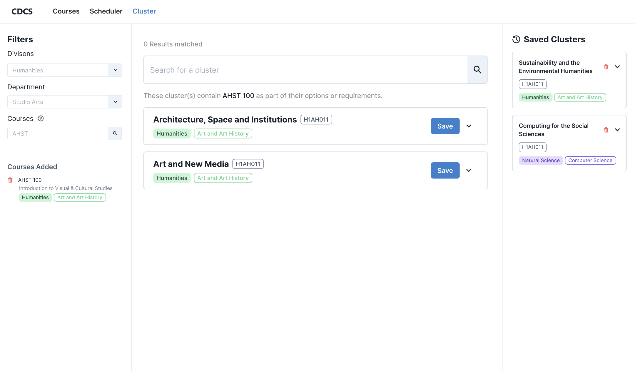
User is looking at the cluster search results.
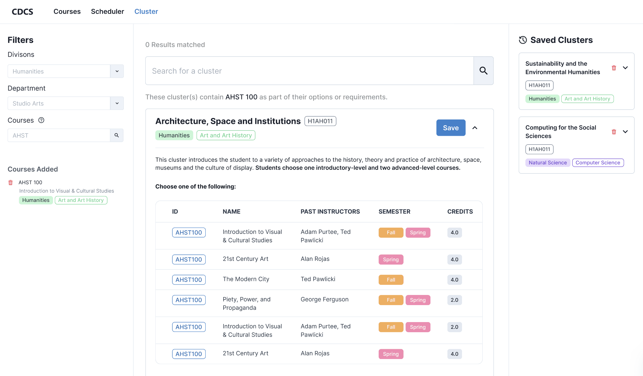
User clicks anywhere on the cluster card to open it. Cluster cards show the courses that make up the cluster, where each course has its ID, name, past instructors, semesters offered, and credits shown.
User is looking at the cluster search results.
User clicks anywhere on the cluster card to open it. Cluster cards show the courses that make up the cluster, where each course has its ID, name, past instructors, semesters offered, and credits shown.
User is looking at the cluster search results.
User clicks anywhere on the cluster card to open it. Cluster cards show the courses that make up the cluster, where each course has its ID, name, past instructors, semesters offered, and credits shown.
User is looking at the cluster search results.
User clicks anywhere on the cluster card to open it. Cluster cards show the courses that make up the cluster, where each course has its ID, name, past instructors, semesters offered, and credits shown.
Saving a Cluster
User is looking at the cluster search results and decides on which cluster to save by clicking on the blue Save button.
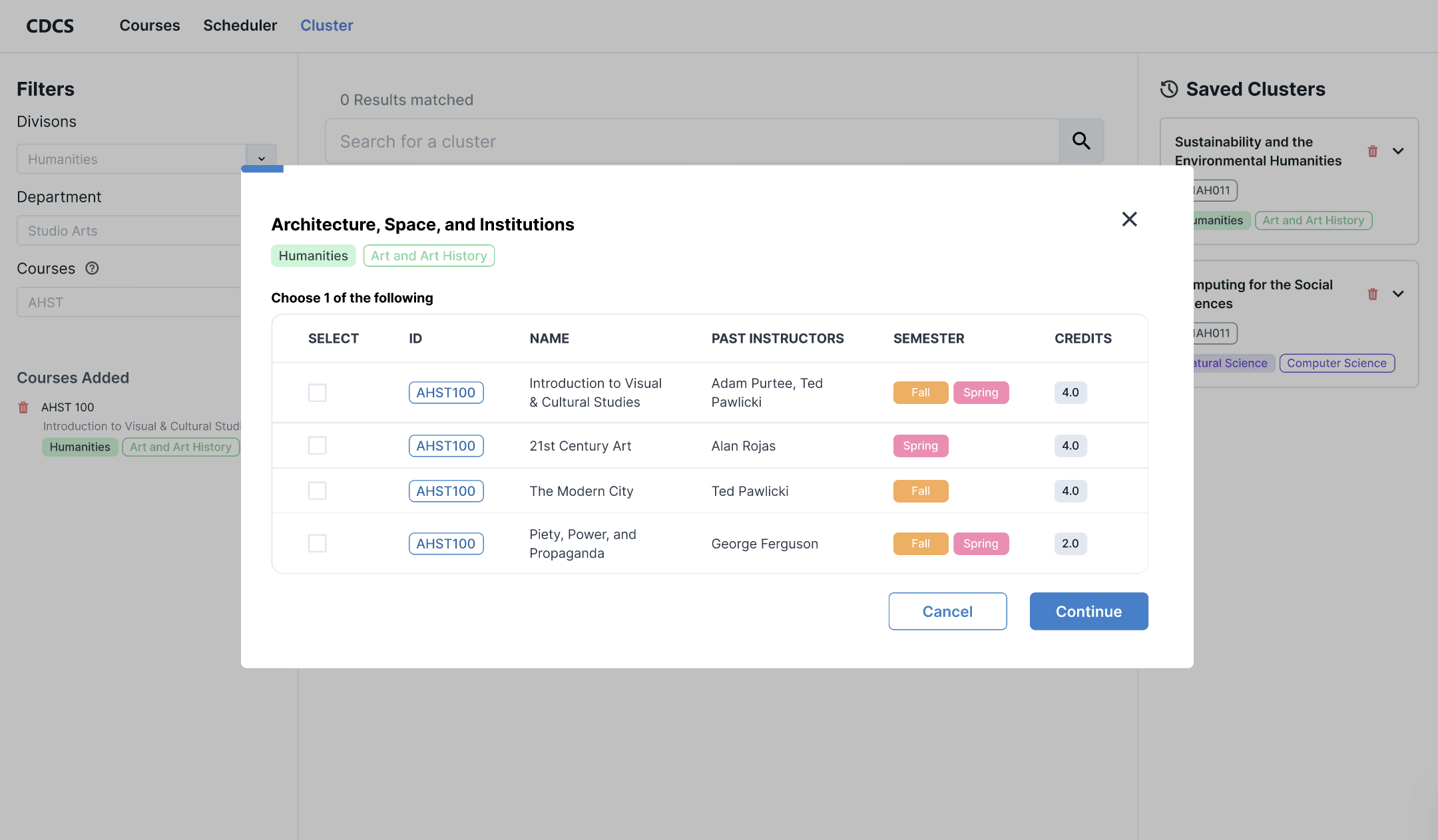
The cluster selection modal is opened, displaying the first section to choose a course from. Each step tells the user how many courses they can select for the current section. The progress bar is displayed at the top.
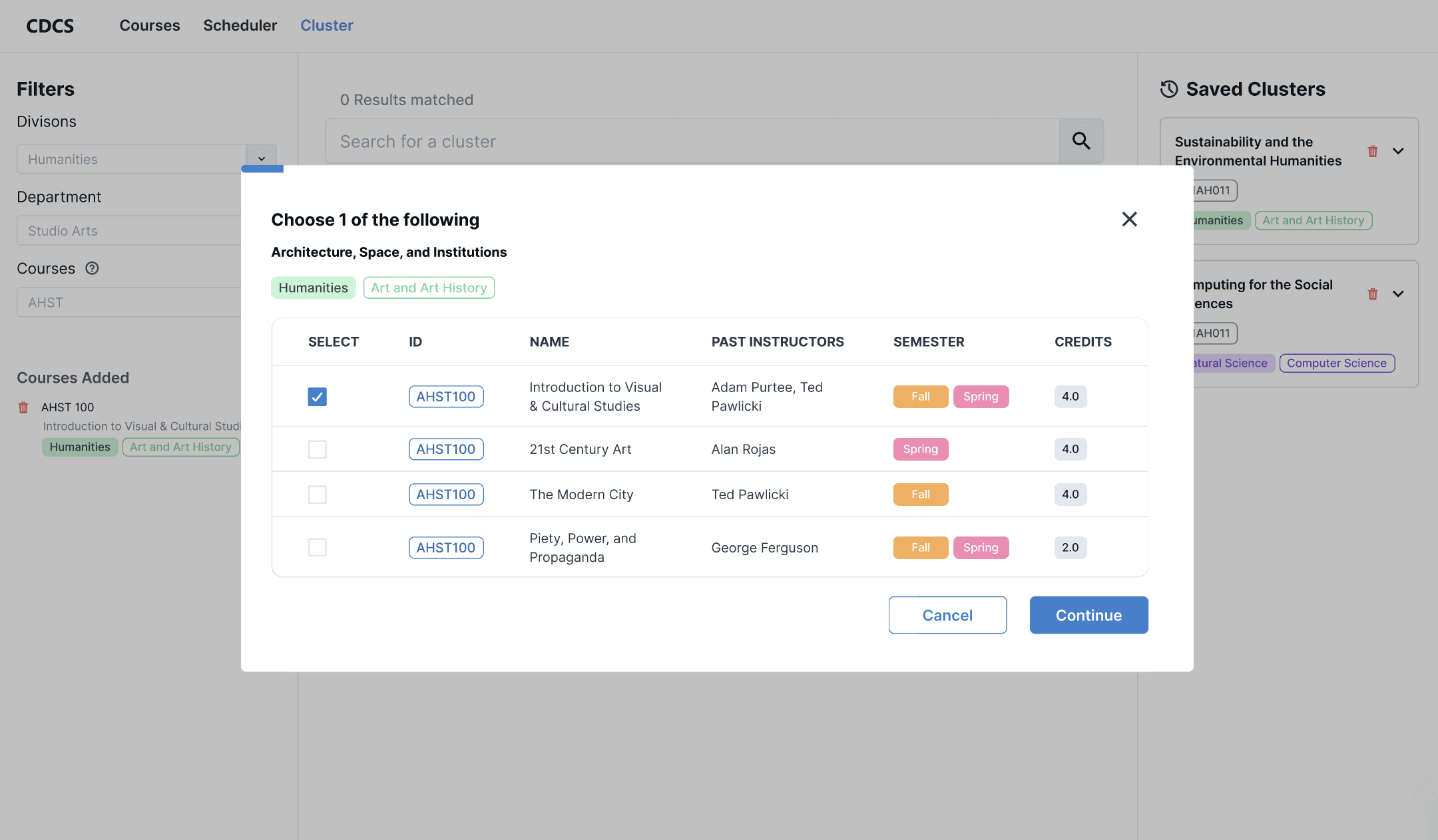
User selects desired course and clicks continue.
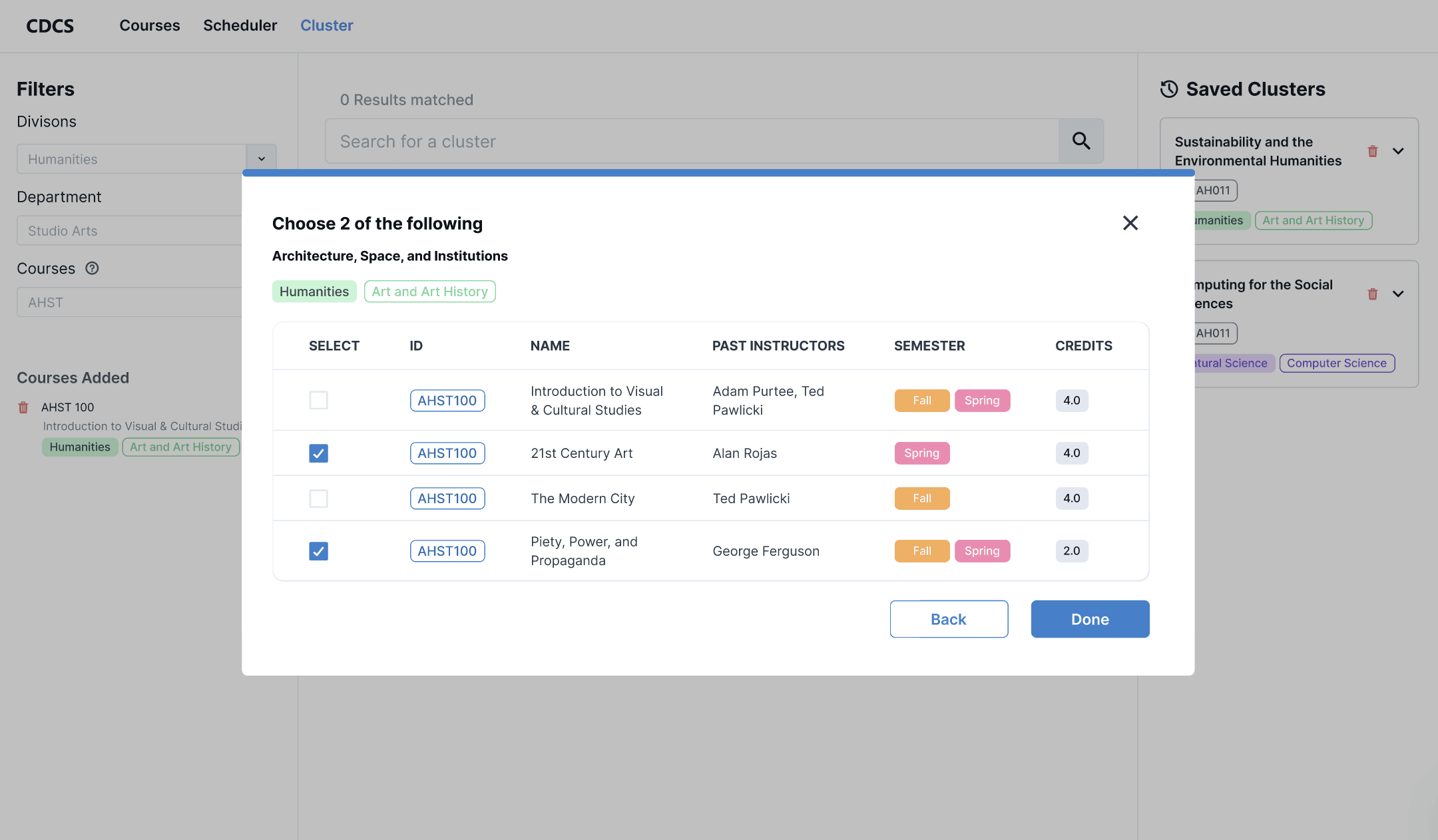
User moves to the next step and selects desired courses. For this section, the user must select 2 courses.
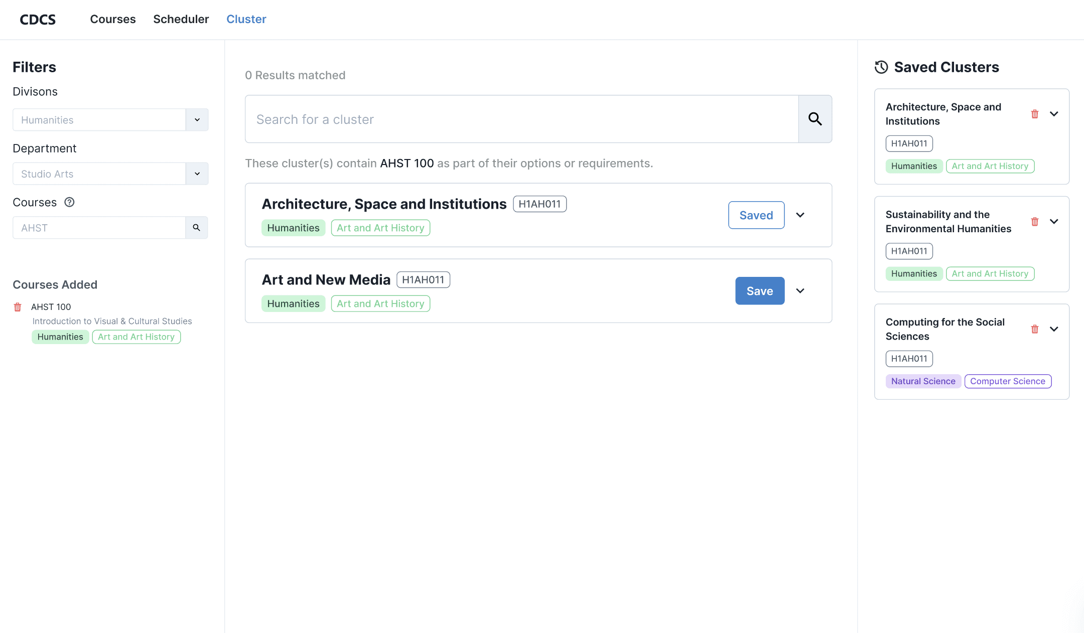
Once the user clicks done, the cluster appears in the Saved Clusters section.
User is looking at the cluster search results and decides on which cluster to save by clicking on the blue Save button.
The cluster selection modal is opened, displaying the first section to choose a course from. Each step tells the user how many courses they can select for the current section. The progress bar is displayed at the top.
User selects desired course and clicks continue.
User moves to the next step and selects desired courses. For this section, the user must select 2 courses.
Once the user clicks done, the cluster appears in the Saved Clusters section.
User is looking at the cluster search results and decides on which cluster to save by clicking on the blue Save button.
The cluster selection modal is opened, displaying the first section to choose a course from. Each step tells the user how many courses they can select for the current section. The progress bar is displayed at the top.
User selects desired course and clicks continue.
User moves to the next step and selects desired courses. For this section, the user must select 2 courses.
Once the user clicks done, the cluster appears in the Saved Clusters section.
User is looking at the cluster search results and decides on which cluster to save by clicking on the blue Save button.
The cluster selection modal is opened, displaying the first section to choose a course from. Each step tells the user how many courses they can select for the current section. The progress bar is displayed at the top.
User selects desired course and clicks continue.
User moves to the next step and selects desired courses. For this section, the user must select 2 courses.
Once the user clicks done, the cluster appears in the Saved Clusters section.
Edit a Saved Cluster
User is looking at the cluster search results and decides on which cluster to save by clicking on the blue Save button.
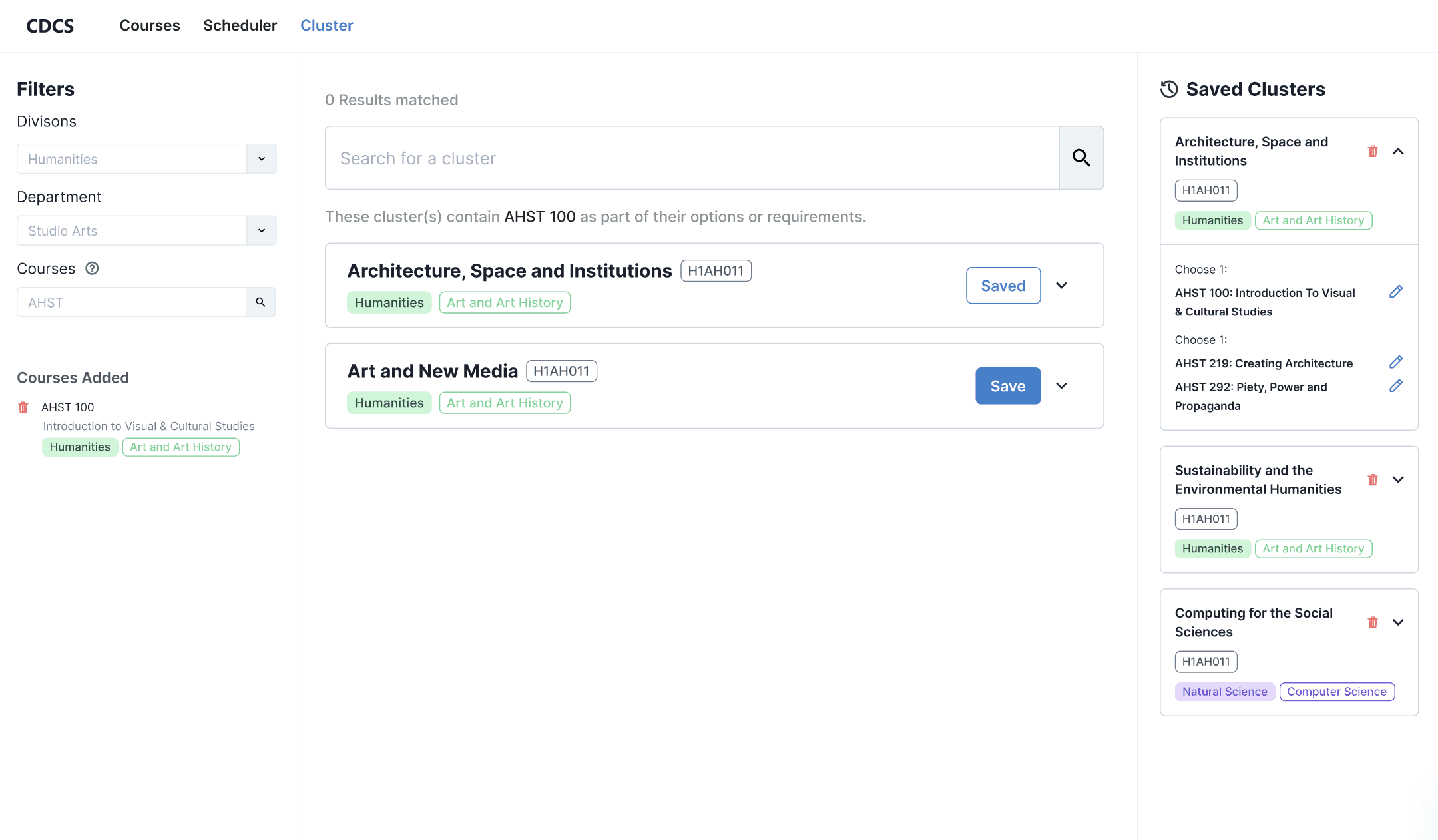
User opens the saved cluster card they want to edit. The user clicks on the edit button that corresponds to the course they want to change.
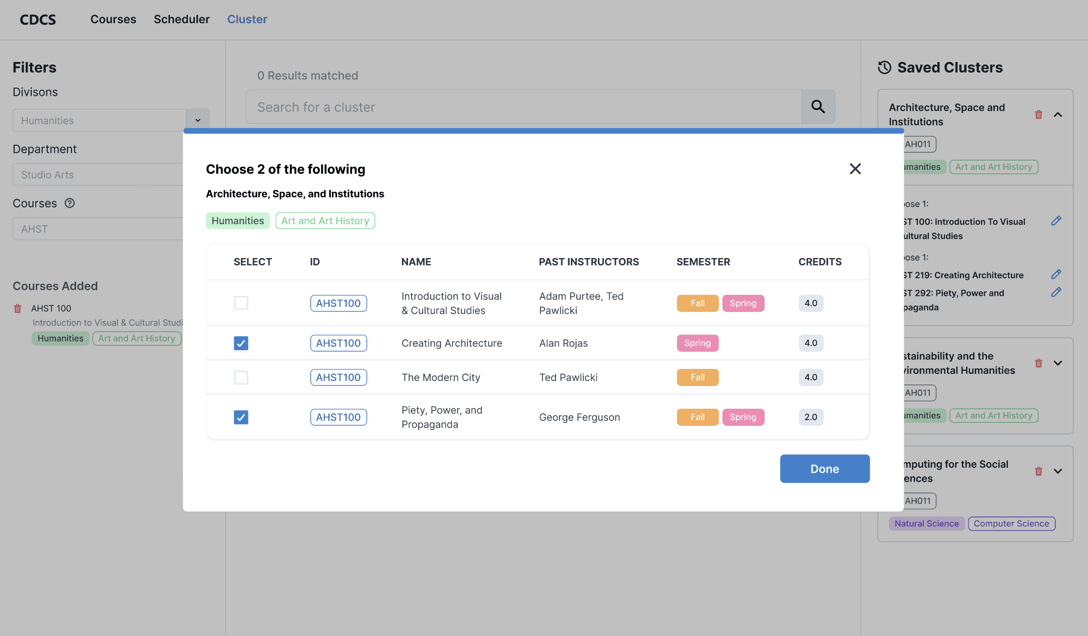
The cluster selection modal opens to the section the edited course belongs to.
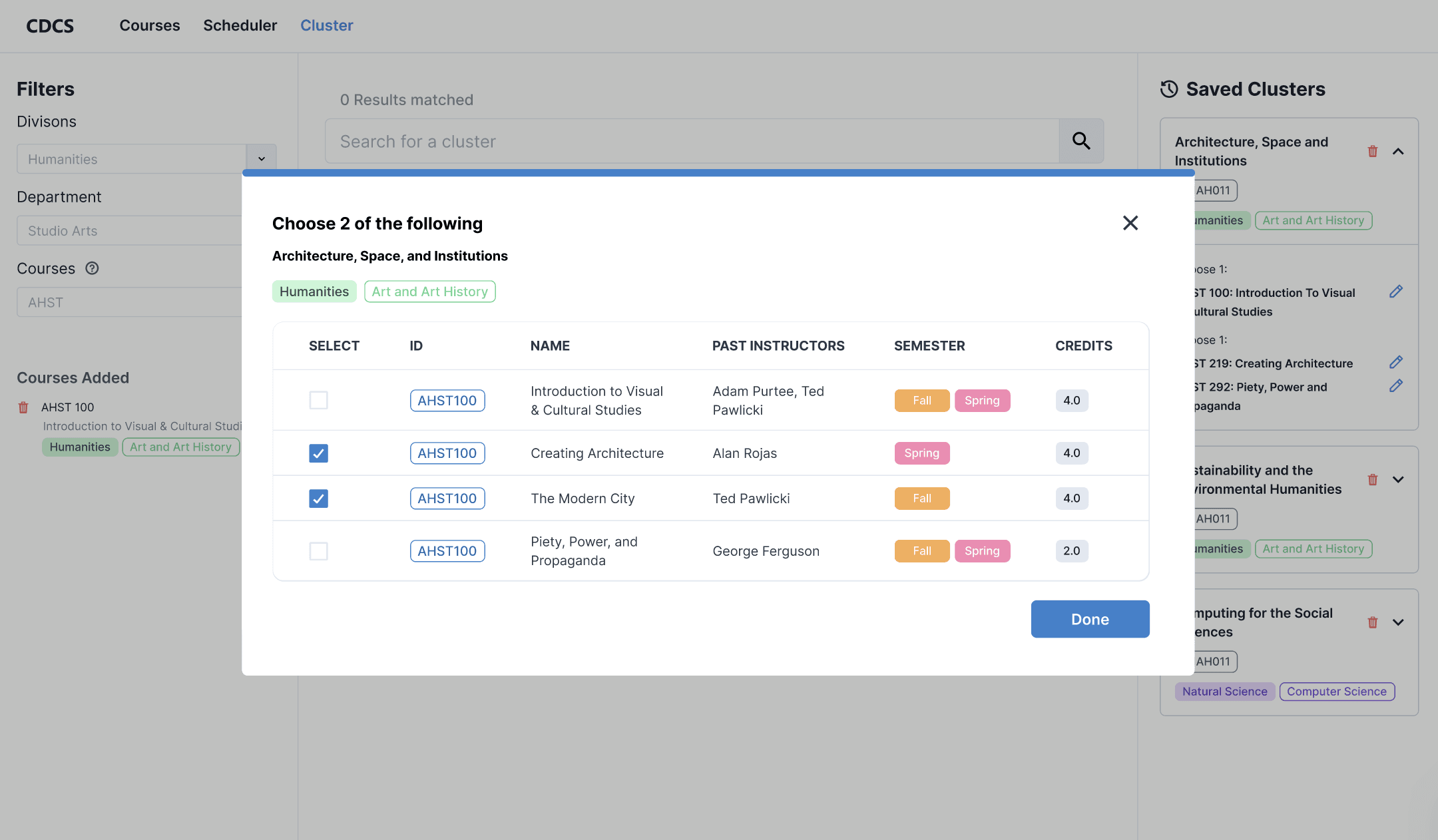
User deselects the course they don't want and replaces it with a different course to satisfy the section's 2 course requirement.
User finishes selection by clicking done and the saved cluster reflects the user's changes.
User is looking at the cluster search results and decides on which cluster to save by clicking on the blue Save button.
User opens the saved cluster card they want to edit. The user clicks on the edit button that corresponds to the course they want to change.
The cluster selection modal opens to the section the edited course belongs to.
User deselects the course they don't want and replaces it with a different course to satisfy the section's 2 course requirement.
User finishes selection by clicking done and the saved cluster reflects the user's changes.
User is looking at the cluster search results and decides on which cluster to save by clicking on the blue Save button.
User opens the saved cluster card they want to edit. The user clicks on the edit button that corresponds to the course they want to change.
The cluster selection modal opens to the section the edited course belongs to.
User deselects the course they don't want and replaces it with a different course to satisfy the section's 2 course requirement.
User finishes selection by clicking done and the saved cluster reflects the user's changes.
User is looking at the cluster search results and decides on which cluster to save by clicking on the blue Save button.
User opens the saved cluster card they want to edit. The user clicks on the edit button that corresponds to the course they want to change.
The cluster selection modal opens to the section the edited course belongs to.
User deselects the course they don't want and replaces it with a different course to satisfy the section's 2 course requirement.
User finishes selection by clicking done and the saved cluster reflects the user's changes.
Cluster
Calendar
4yr Plan
Cluster Search Engine
Context
The University of Rochester requires students to take courses in each academic division (natural sciences, social sciences, humanities) to graduate.
Clusters fall under one of the three academic divisions and consist of a few courses. Students can take clusters to fulfill academic divisions not covered by their major(s)/minor(s).
The Problem
The official cluster search engine has a clunky and difficult to understand design.
Here are the problems we found with this design:
Upon search, all results are fully displayed, leading to unnecessary scrolling.
The language is inconsistent. Ex. "Choose one of the following" and "You may also choose one of the following."
Courses are displayed that haven't been offered in over 5 years.
Goal
We wanted to make Melcourses' version of the cluster search engine less overwhelming while staying within the existing Melcourses brand identity.
Iteration
We started with a layout that looked like our existing course search page. We kept these things consistent:
Filters on the left
Search results in the center, with results taking up most of the page space
Editing on the right
Button shape and colors
Users can see the IDs of the courses offered in the cluster, the past instructors of each course, what semesters courses are offered in, and the ability to select a course to take in a cluster.
In addition, we were also playing with the idea of having a modal for the process of selecting the courses to take in a cluster.
The steps of the modal mirror the steps of the official cluster search engine, where step 1 corresponds to the first set of choices displayed in a cluster, step 2 corresponds to the second set of choices displayed in a cluster, and so on.
For the next iteration, we made changes to all sections of the page.
To summarize changes:
We gave users the ability to look up clusters that include specific courses and made it fit it with existing design principles
Introduced category headers for clusters, mirroring the official cluster search engine design
Replaced 4-year planner integration with a cluster guide
The next iteration, we scrapped the cluster guide section for a saved cluster feature. The cluster guide wasn't useful for the majority of users since the school makes it known that clusters are apart of a graduation requirement.
We replaced the righthand section with saved clusters, which allows users to save their cluster selections without adding them to a schedule or plan.
As for the saved cluster cards, we had two variations for the design. Users could either edit their saved clusters by section or edit the entire cluster at once.
Each section can be edited, and clicking on an edit button will take the user to the appropriate step in the modal.
Only the whole cluster can be edited, which takes the user through each step of the selection process again. User course choices would be saved.
Our team voted to use the design of letting users edit a cluster by its section, which led to the iteration below. We made some visual changes to the saved cluster cards, like making the edit button blue to indicate it's selectable or adding in course names next to the course ID.
When users click the Save button, they're taken to a step-by-step modal selection screen. We removed the drop-down from the cluster card and put the information within the drop-down into the modal instead.
After receiving feedback, we returned the drop-down feature. Users would be able to look at cluster information via the drop-down, but not be able to select courses in the drop-down (unlike before). Cluster course selection would only be accessible by clicking the Plan button.
For modal changes, we wanted to implement a better way for users to visualize their selection progress. We took inspiration from LinkedIn's easy apply modal.
We mainly liked the progress bar they used, which we translated into the design below.
Upon the next iteration, we made these changes:
Put the progress bar at the top and removed the percentage, as that was already indicated by progress bar size
Added a "Credits" column
Removed "Step X" text, as that information was redundant due to the progress bar
Final Design
For the final design, we considered 4 different user journeys on the cluster search page.
Searching and Filtering Clusters
User starts on the cluster search page with no filters selected.
User clicks on the division filter and chooses between humanities, natural science, social science, or all divisions.
When sorted by humanities, for example, then clusters that belong to the humanities division are shown.
User filters by the studio art department and now clusters that are in the humanities division AND studio art department are shown.
User searches for clusters that include a specific art history (AHST) course.
Only clusters in the humanities division, studio art department, AND include the AHST 100 course are shown.
User starts on the cluster search page with no filters selected.
User clicks on the division filter and chooses between humanities, natural science, social science, or all divisions.
When sorted by humanities, for example, then clusters that belong to the humanities division are shown.
User filters by the studio art department and now clusters that are in the humanities division AND studio art department are shown.
User searches for clusters that include a specific art history (AHST) course.
Only clusters in the humanities division, studio art department, AND include the AHST 100 course are shown.
User starts on the cluster search page with no filters selected.
User clicks on the division filter and chooses between humanities, natural science, social science, or all divisions.
When sorted by humanities, for example, then clusters that belong to the humanities division are shown.
User filters by the studio art department and now clusters that are in the humanities division AND studio art department are shown.
User searches for clusters that include a specific art history (AHST) course.
Only clusters in the humanities division, studio art department, AND include the AHST 100 course are shown.
User starts on the cluster search page with no filters selected.
User clicks on the division filter and chooses between humanities, natural science, social science, or all divisions.
When sorted by humanities, for example, then clusters that belong to the humanities division are shown.
User filters by the studio art department and now clusters that are in the humanities division AND studio art department are shown.
User searches for clusters that include a specific art history (AHST) course.
Only clusters in the humanities division, studio art department, AND include the AHST 100 course are shown.
View Cluster Information
User is looking at the cluster search results.
User clicks anywhere on the cluster card to open it. Cluster cards show the courses that make up the cluster, where each course has its ID, name, past instructors, semesters offered, and credits shown.
User is looking at the cluster search results.
User clicks anywhere on the cluster card to open it. Cluster cards show the courses that make up the cluster, where each course has its ID, name, past instructors, semesters offered, and credits shown.
User is looking at the cluster search results.
User clicks anywhere on the cluster card to open it. Cluster cards show the courses that make up the cluster, where each course has its ID, name, past instructors, semesters offered, and credits shown.
User is looking at the cluster search results.
User clicks anywhere on the cluster card to open it. Cluster cards show the courses that make up the cluster, where each course has its ID, name, past instructors, semesters offered, and credits shown.
Saving a Cluster
User is looking at the cluster search results and decides on which cluster to save by clicking on the blue Save button.
The cluster selection modal is opened, displaying the first section to choose a course from. Each step tells the user how many courses they can select for the current section. The progress bar is displayed at the top.
User selects desired course and clicks continue.
User moves to the next step and selects desired courses. For this section, the user must select 2 courses.
Once the user clicks done, the cluster appears in the Saved Clusters section.
User is looking at the cluster search results and decides on which cluster to save by clicking on the blue Save button.
The cluster selection modal is opened, displaying the first section to choose a course from. Each step tells the user how many courses they can select for the current section. The progress bar is displayed at the top.
User selects desired course and clicks continue.
User moves to the next step and selects desired courses. For this section, the user must select 2 courses.
Once the user clicks done, the cluster appears in the Saved Clusters section.
User is looking at the cluster search results and decides on which cluster to save by clicking on the blue Save button.
The cluster selection modal is opened, displaying the first section to choose a course from. Each step tells the user how many courses they can select for the current section. The progress bar is displayed at the top.
User selects desired course and clicks continue.
User moves to the next step and selects desired courses. For this section, the user must select 2 courses.
Once the user clicks done, the cluster appears in the Saved Clusters section.
User is looking at the cluster search results and decides on which cluster to save by clicking on the blue Save button.
The cluster selection modal is opened, displaying the first section to choose a course from. Each step tells the user how many courses they can select for the current section. The progress bar is displayed at the top.
User selects desired course and clicks continue.
User moves to the next step and selects desired courses. For this section, the user must select 2 courses.
Once the user clicks done, the cluster appears in the Saved Clusters section.
Edit a Saved Cluster
User is looking at the cluster search results and decides on which cluster to save by clicking on the blue Save button.
User opens the saved cluster card they want to edit. The user clicks on the edit button that corresponds to the course they want to change.
The cluster selection modal opens to the section the edited course belongs to.
User deselects the course they don't want and replaces it with a different course to satisfy the section's 2 course requirement.
User finishes selection by clicking done and the saved cluster reflects the user's changes.
User is looking at the cluster search results and decides on which cluster to save by clicking on the blue Save button.
User opens the saved cluster card they want to edit. The user clicks on the edit button that corresponds to the course they want to change.
The cluster selection modal opens to the section the edited course belongs to.
User deselects the course they don't want and replaces it with a different course to satisfy the section's 2 course requirement.
User finishes selection by clicking done and the saved cluster reflects the user's changes.
User is looking at the cluster search results and decides on which cluster to save by clicking on the blue Save button.
User opens the saved cluster card they want to edit. The user clicks on the edit button that corresponds to the course they want to change.
The cluster selection modal opens to the section the edited course belongs to.
User deselects the course they don't want and replaces it with a different course to satisfy the section's 2 course requirement.
User finishes selection by clicking done and the saved cluster reflects the user's changes.
User is looking at the cluster search results and decides on which cluster to save by clicking on the blue Save button.
User opens the saved cluster card they want to edit. The user clicks on the edit button that corresponds to the course they want to change.
The cluster selection modal opens to the section the edited course belongs to.
User deselects the course they don't want and replaces it with a different course to satisfy the section's 2 course requirement.
User finishes selection by clicking done and the saved cluster reflects the user's changes.